Prince, S. (2010) Through the Looking Glass: Philosophical Toys and Digital Visual Effects. Projections, 4(2), pp. 19-40
Throughout his journal article, the author Stephen Prince, is taking us through the evolution of special effects,
all the way from the age of the phenakistoscope to our modern day and age CG software.
The first philosophical toy was 'camera obscura' because of its applications to both art and science.
Scientists and natural philosophers invented these optical devices to aid their inquiries into such visual phenomena as persistence of vision, stroboscopic motion, and binocular depth perception.
Some of the philosophical toys were:
-
the phenakistoscope
-
the kaleidoscope
-
the phonic kaleidoscope
-
the thaumatrope
-
the pseudoscope
Art and science, combined invented the cinema and they have continued to work together in the decades since.
Stephen Prince is also mentioning the new era CG, photogrammetry and other new visual effects techniques that are now used in films and are creating distorted realities or are helping with showing past times and locations that no longer look the same.

Camera Obscura - Michelangelo drawing blood

Camera Obscura


Pseudoscope
Phenakistoscope
McClean, S. (2008) Digital storytelling: the narrative power of visual effects in film. Cambridge, Massachusetts: The MIT Press
A filmmaker who tries to take a famous story into a film is in a very difficult position as there will be a lot of pressure on him/her if the expectations will not be met.
In the The Teller and the Tale: The ''Chinese Whispers'' of Adaptation chapter, the author compares how VFX can either bring life to a story or take it away if not used properly.
The author is comparing a novel written in 1957 written by Shirley Jackson, called The Haunting of Hill House with its first film adaptation and the remake.
The first film made by Robert Wise in 1963 got most of the story right, making good use of odd camera angles and lighting, giving the film a creepy feeling with only traditional effects from back then.
The remake made in 1999 by Jan de Bont made use of the most advanced DVFX at the time, however it did not capture the story right.


Manovich, L. (2001) 'Digital Cinema' ,The Language of New Media. Cambridge MA: MIT press
In this article, the author, Lev Manovich, examines what is now happening to the cinema's indexical identity, if now it is possible to be able to create almost any type of scene on a computer. He is stating that due to the advanced technology, cinema can no longer be properly distinguished from animation and that it has become a sub-genre of painting.
Manovich is going back in history to point out how cinema was referred to back then, cinematograph, moving images, kinetoscope, in order to give us an idea of how it was understood, as the art of motion.
Manovich argues that the manipulation of digital data affects the reality of cinema, making cinema and animation relatively the same thing. However, there is a difference between animation and cinema. Animation is basically just that, animation. The audience knows that what they are watching is not real. Whereas when it comes to cinema, cinema is trying to erase all proof of the production process, so the audience can actually believe what they are seeing.
Gunning, T. (2006) 'The Cinema of Attractions: Early Film, Its Spectator and the Avant-Garde', in Strauven, W. (1.) The Cinema of Attractions Reloaded. Amsterdam: Amsterdam University Press, pp. 381-388
In his text, Tom Gunning, re-explores the beginnings of film, referring to early filmmakers like Smith, Méliès and Porter and to their contributions to cinema.
The cinema of attractions is an exhibitionist cinema. A characteristic of early cinema is the recurring look of actors to the camera, engaging the spectators' attention. This is a cinema that is willing to break the illusion of the film in order to get the viewers' attention.
This cinema does not follow the classical narrative, as its energy is merely used on the development of the psychology of the characters and it is more used outwardly, towards the acknowledged spectators. It is later recognized that by interacting with the audience the realism is taken away and it is highly critiqued, giving more reason for the narrative film to rise. But the non-narrative films didn't really disappear as wee can still see up to this day, sub-genres of it, like musicals.
The Code, Shapes, 21:00 03/08/2011, BBC2 England, 60 mins. https://learningonscreen.ac.uk/ondemand/index.php/prog/01E00B35?bcast=68266791
The Universe is lazy, it will always seek out the most efficient solution.
At the atomic level, the world is structured around strict geometric laws, that were first recognized by the Greeks, thousand of years ago.
Jackson Pollock has been called 'The artist of the 20th Century'. A drunk who would start splattering paint down a canvas, while intoxicated has accidentally given the world the concept of 'Fractals'.
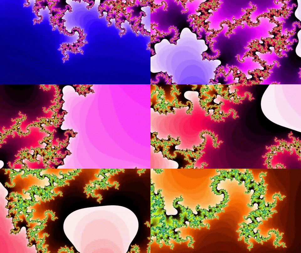
Loren Carpenter has revolutionized Hollywood when he created in the 1980s, an algorithm that would allow him to create a virtual environment for a commercial he was working on.
After getting inspired by Mandlebrot's books, he realised he could use the mathematics of fractals to be able to create virtual worlds.
He created an image made of 100 triangles that he then broke into around 5 billion triangles, to the point you wouldn't be able to see any triangles, therefore being able to create the virtual environment he was looking for.


Mori M., The Uncanny Valley (Translated by Karl F. MacDorman and Norri Kageki), pp. 98-100
In 1970, an essay has been published by a robotics professor from Tokyo, Masahiro Mori, in which he envisioned the way humans would interact with lifelike robots. He hypothesized that humans' response to a lifelike robot would quickly shift from empathy to revulsion. This eeriness is known as 'The Uncanny Valley.
For many years, the research hasn't drawn any attention to it, however recently, as robotics kept on going better and our technology advanced and robotics engineers are now able to create robots that are more and more humanlike, the subject has been starting to get more popular and it most likely will get to be more known in the future as we keep advancing to the robotics apex.
Most humans would indeed be creeped out by robots that look humanlike, but don't interact the same way humans do. But in the future, maybe hundreds of years from now, humans will co-exist with their inventions in a humanlike manner.

The 12 Principles of Animation
1. Squash and stretch
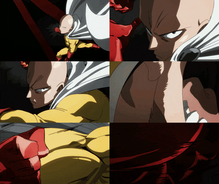
This action gives the illusion of weight and volume to a character as it moves.
2. Anticipation
Prepares the audience for a major action the character is about to perform.
3. Staging
It's a presentation of an idea so that it is clear.
4. Straight Ahead & Pose to Pose
Pose to pose draws the key actions and then fills in the rest, whereas Straight Ahead is a continuous series of drawings.
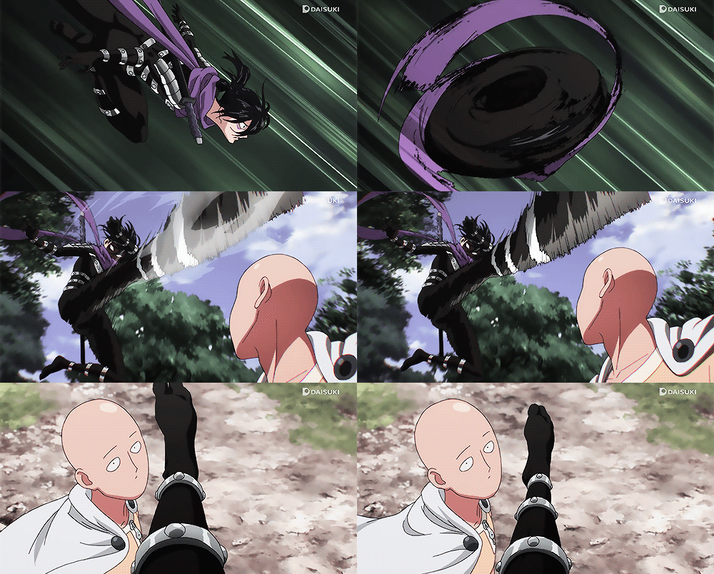
5. Follow through and Overlapping
When the main body of the character stops, all other parts continue to catch up to the main part, nothing stops all at once.
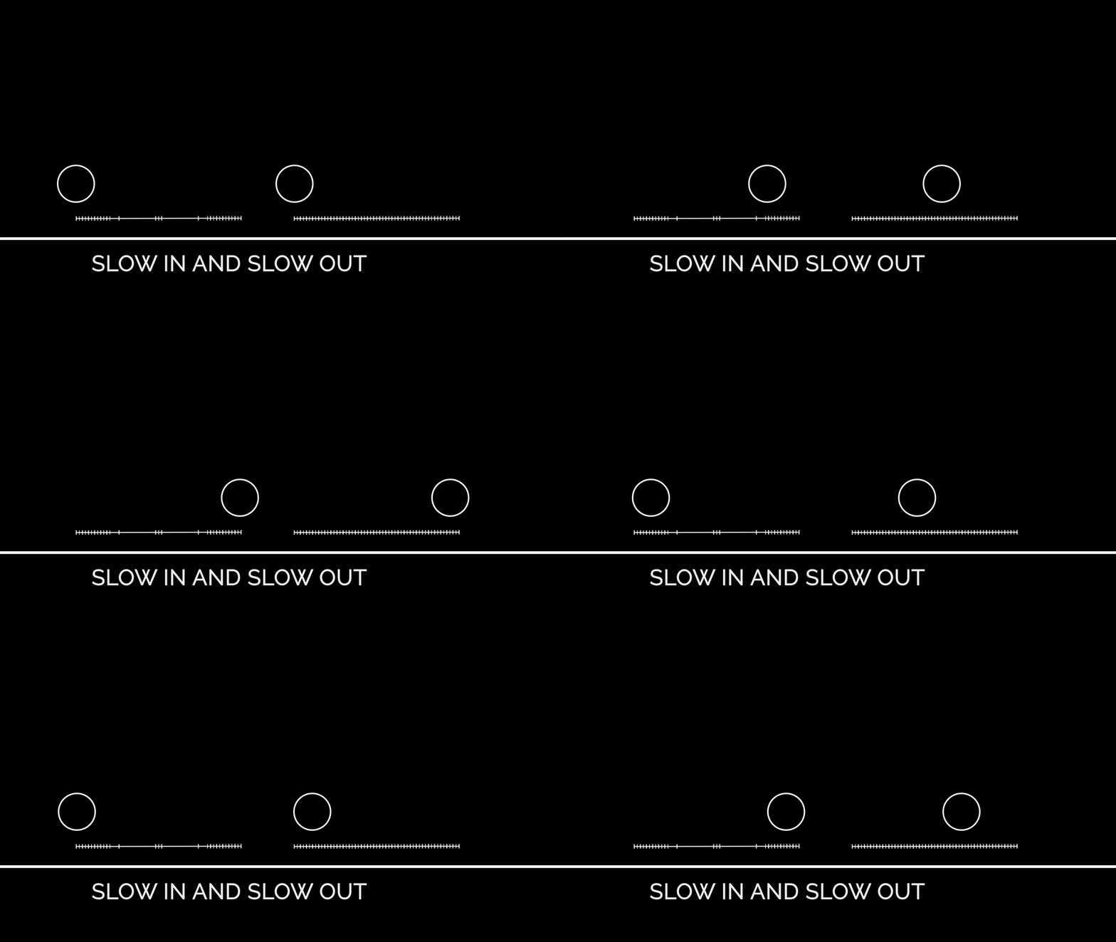
6. Slow In and Slow Out
As the action starts, there are more drawings in the beggining, a few in the middle and more in the end. The fewer drawings, the faster the action. The more drawings, the slower the action.
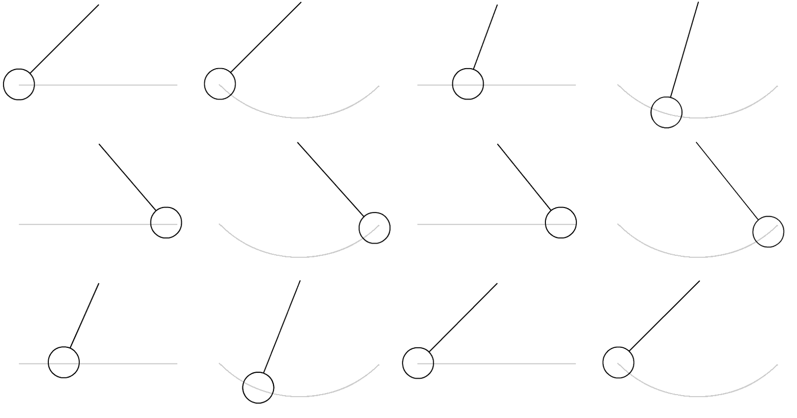
7. Arcs
All actions, with few exceptions, follow a slightly circular path . Arcs give animation a more natural action and better flow.
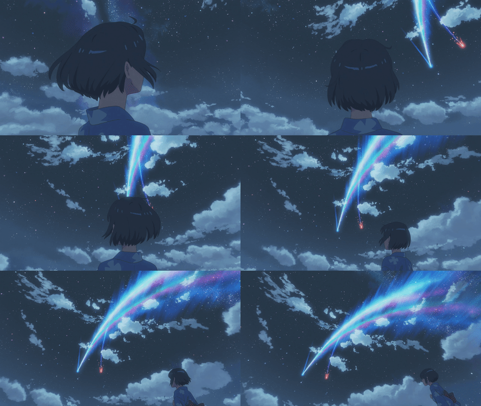
8. Secondary Action
It's an additional action in the scene used as a supplement of the main one.
9. Timing
More drawings between poses slow and smooth the action. Fewer drawings make the action faster and crisper.
Timing mantains the appearence of an object abiding by the law of phisics.
10. Exaggeration
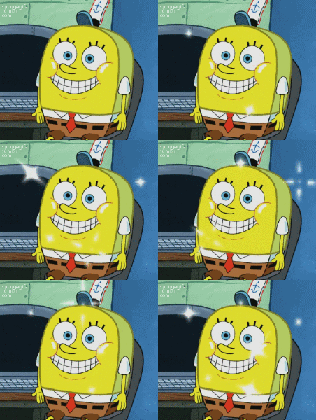
The animation remains true to reality, only it's presented in a wilder, more extreme form.
11. Solid Drawings
It's taking into account forms in three dimensional space, giving them volume and weight.
12. Appeal
It's a quality of charm, able to please the viewer's eyes. It's the charisma of the action.






My essay choice is 'Visual effects and the Hollywood remake'.

Visual effects and the Hollywood remake
In my opinion, trying to make a film after a popular book that people love and appreciate can be a difficult task for filmmakers. The same is true about remakes of original films. Some do manage to meet the audience’s expectations, some fail miserably.
In this essay I will point out what I think the filmmakers of the remakes of the ‘IT’ original miniseries from 1990, which were made after Stephen King’s novel with the same name, got right and what they got wrong from my point of view.
As a kid I used to love watching the ‘IT’ I knew back then. Although old and low quality, ‘IT’ was one of my favorite films. After having watched with a little bit of nostalgia the miniseries again I have come to the conclusion that the story of the town Derry was well presented and the audience got the most of the main idea out of the film. A group of kids from Derry, United States are being attacked by monstruous creatures during summertime. Once every 27 years ‘It’ is waking out of its slumber to feast on adults and mostly children. All of these appearances are connected to Pennywise the dancing clown, who the kids refer to as ‘It’, as it is not a person, but a monster.
The original miniseries use very little digital visual effects, as during that period of time digital visual effects were merely emerging. Tommy Lee Wallace, the director of the original ‘IT’, makes use of a lot of physical special effects. The remakes, directed by Andy Muschietti, use a lot of CGI and in my opinion, that is what makes the story even more special. We can see what ‘It’ would actually look like when it’s transforming. We can see how in the beginning of the first remake film Pennywise is biting off little Georgie’s whole right arm and how he’s taken down the sewers, something which is not shown in the original miniseries because it would not have been possible back then to create such a grotesque scene. Due to the use of advanced, proper CGI we are able to see and understand better Pennywise’s world. A grotesque, dark, morbid reality that is a gateway to your deepest, darkest fears and phobias.
Stephen King stated in an interview taken by Warner Bros. Entertainment that he has ‘used Pennywise as a door opener for all the other things that these kids are scared of.’ ‘The kids see transformations of Pennywise that are his own artistic creations, but they still relay to the various fears and phobias of the kids.’ In my opinion, this is an element that is very well presented in the remakes due to the high quality level of special effects that we have gotten to. Without the level of quality of special effects that we currently have we would not be able to fully understand Stephen King’s world. Of course, reading the novel and imagining what Stephen has written would be sufficient to understand this world. But being able to actually see what this world would look like is very terrifying and incredible in the same time.
Andy Muschietti’s version of Pennywise is more detailed and better than Tommy Lee Wallace’s version.
The physical special effects in the original were good and well used. A scene like the one where young Richie is being attacked by a werewolf in the school’s basement or the one where young Eddie is getting attacked by the head showers from his school are pretty convincing.
Although the digital visual effects were bad back then and there are some scenes like the one where Pennywise is getting hit in the head by Beverly with a silver earring and then he is sort of minimizing himself to fit through a pipe, that makes the film laughable, there were two specific scenes where the digital visual effects were well used.
The first scene is when after Georgie’s death, still grieving, Bill is going to his little brother’s room and starts looking through a photo album. When he is looking at a recent photograph of Georgie, the image blinks back at Bill.
The second scene is when all the young ‘losers’ as they would call themselves after having their group named ‘The Losers Club’, are looking through Mikey’s black and white photograph album and seeing images with old Derry. Finally they get to an image that shows a street from the old Derry and a clown in the middle of the street. The image starts moving and Pennywise starts dancing and as he gets closer and closer to the losers the image starts to take color and Pennywise is right in front of the losers. He then reaches out with one of his hands out of the book to get the losers, but Stanley rapidly closes the book and all of them are in complete shock. That was a well done scene.
In the remake, the action is happening at a faster rate, whereas in the original, the action is a little bit slower, which can make the film boring to watch at times.
In the The Teller and the Tale: The ''Chinese Whispers'' of Adaptation chapter from the book ‘Digital storytelling: the narrative power of visual effects in film’, written by Shilo T. McClean, the author compares how VFX can either bring life to a story or take it away if not used properly.
The author is comparing a novel written in 1957 by Shirley Jackson, called The Haunting of Hill House with its first film adaptation and the remake. The first film made by Robert Wise in 1963 got most of the story right, making good use of odd camera angles and lighting, giving the film a creepy feeling with only traditional effects from back then. The remake made in 1999 by Jan de Bont made use of the most advanced DVFX at the time, however it did not capture the story right.
McClean is of the opinion that a filmmaker does not need to focus on using a lot of visual effects as long as the story is well interpreted. The special visual effects should be used to compliment the film, not to take over the film.
That is completely true and the remakes of ‘IT’ use a lot of visual effects, but not too much. Not to the point where the film becomes annoyingly chaotic. The visual effects were used just right. They were used to show Its transformations so the audience can understand Stephen King’s horrific universe. The visual effects were used to compliment Pennywise, not to ridicule him by overusing them.
The only small problem from the remakes are the few failed editing cuts. For example in the first remake ‘IT’ film when Bill and Beverly have a kiss at the end of the film after having Pennywise defeated, Beverly’s hands on Bill’s face are being held at different angles and different positions when the camera is moving angles, which shows they had to have a few more takes and forgot to edit that out. In the second remake film another mistake of this kind is when after Eddie gets stabbed in the face, in his left cheek by Henry Bowers and then manages to escape. He after that moment wears a band aid on his face. Later on, when they go in the sewers so they can perform the ‘ritual of Chud’ in order to defeat Pennywise, Eddie’s band aid is on either his left cheek or on his right cheek when different camera angles are taken.
This sort of mistake can be very subtle if you are fully emerged in the film and don’t notice it, but can be really off putting when you do notice it and think about the budget involved in the film and how it was very well done up until that very moment. The original ‘IT’ miniseries didn’t have any mistakes of this sort, as far as I can remember or I did not notice them, which means they were very subtle.
Although the original miniseries lacked the digital visual effects we have today, the filmmakers still managed to do a very well done job. Making use of the physical special effects, of the make up and the wardrobe they managed to create back then.
One thing that is to be appreciated with both the old IT and the remakes is that there are no silly and annoying jump scares. Both old and new films give you the creeps by they way the story is being developed and by the acting and the proper use of the different camera angles.
The use of digital visual effects has influenced the production of the remakes in an astonishing way.
Stephen Prince, writer of ‘Through the Looking Glass: Philosophical Toys and Digital Visual Effects’ is talking about the evolution of visual effects all the way from the age where films were referred to as the art of moving images to recent times where photogrammetry and modern visual special effects are an actual thing. The original ‘IT’ miniseries are part of the history of today’s special effects and as bad as some of them were and as good as other ones were, they all contributed to the development and to the mainstream adoption of visual effects, as today even simple films that do not actually require any form of special visual effects are in fact using even a little bit of CGI, such as landscapes.
In conclusion, although the original ‘IT’ miniseries, outdated in CGI, but not lacking in the physical special effects department, in my own opinion, cannot really compare to the new ‘IT’ films as these are two completely different ages of cinema when it comes to special visual effects and although in the original ‘IT’, Tommy Lee Wallace does a great job at bringing Pennywise and Stephen King’s world to life, Andy Muschietti does an even better job at depicting Pennywise, an incredible one. In the remakes there is more detail to every department of the film. There is more detail in the story, in Pennywise’s costume, in the town of Derry, in all the characters’ personalities, a lot of easter eggs and all of these are not achieved, just because of the incredible cast, the incredible makeup they used for Pennywise, the incredible acting of all the actors involved, but they are achieved because of the existence of the special visual effects that have been used in moderation, not excessively. Tommy Lee Wallace couldn’t make a more astounding film than Andy Muschietti did because of the limitations of technology of that day and age, but I am sure that if Tommy would have had access to today’s CGI technology back then he could have made a way better film.
References
Prince, S. (2010) Through the Looking Glass: Philosophical Toys and Digital Visual Effects. Projections, 4(2), pp. 19-40
McClean, S. (2008) Digital storytelling: the narrative power of visual effects in film. Cambridge, Massachusetts: The MIT Press
Bros. Entertainment, Warner IT: Chapter Two | Behind The Scenes: Pennywise
Lives Again | Warner Bros. Entertainment, 2020, www.youtube.com/watch?v=-4zVqbFoJoA&t=344s.